AYLO
AYLO
a new healthcare brand identity
Healthcare should be convenient. Patients and providers should work together. Preventative care is the foundation of great health.
logo.
modern. bold. versatile.

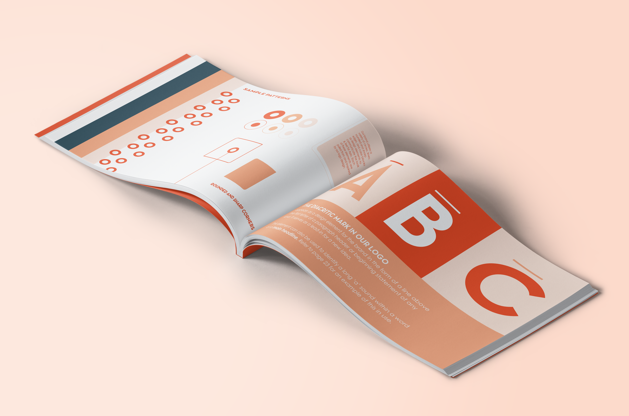
The diacritic mark in Aylo’s logo is the pillar behind the overall design. It functionally exists to instruct a long ‘a’ sound, and it is also a reference to how words are visually represented in a dictionary. This became the perfect metaphor for the Aylo brand, as they continually seek to redefine healthcare.


color palette.
Aylo’s color palette features a burnt orange hero hue- warm, bold, friendly, and very confident. A monochromatic scheme encompasses the full primary colorway, with a cool navy and deep burgundy to compliment and supplement the striking orange.

letterhead.